Reinventing Through Colour & Atmosphere

An online interior direction project developed for clients ready to move beyond safe, neutral interiors and reimagine their home with greater warmth, personality, and visual confidence.

Working remotely, the project focused on creating a clearer sense of identity and atmosphere throughout the home through curated moodboards, colour direction, product sourcing, and surface-led visualisation concepts. The clients felt emotionally ready to reinvent their space but needed guidance translating that shift into cohesive and achievable interior decisions.

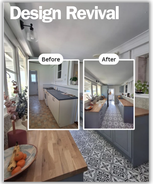
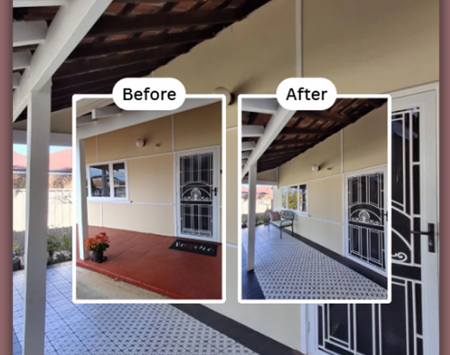
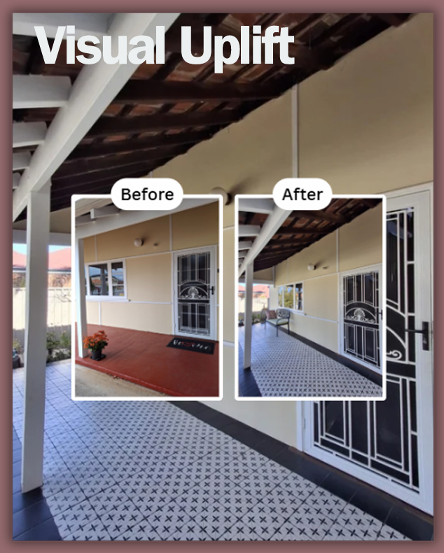
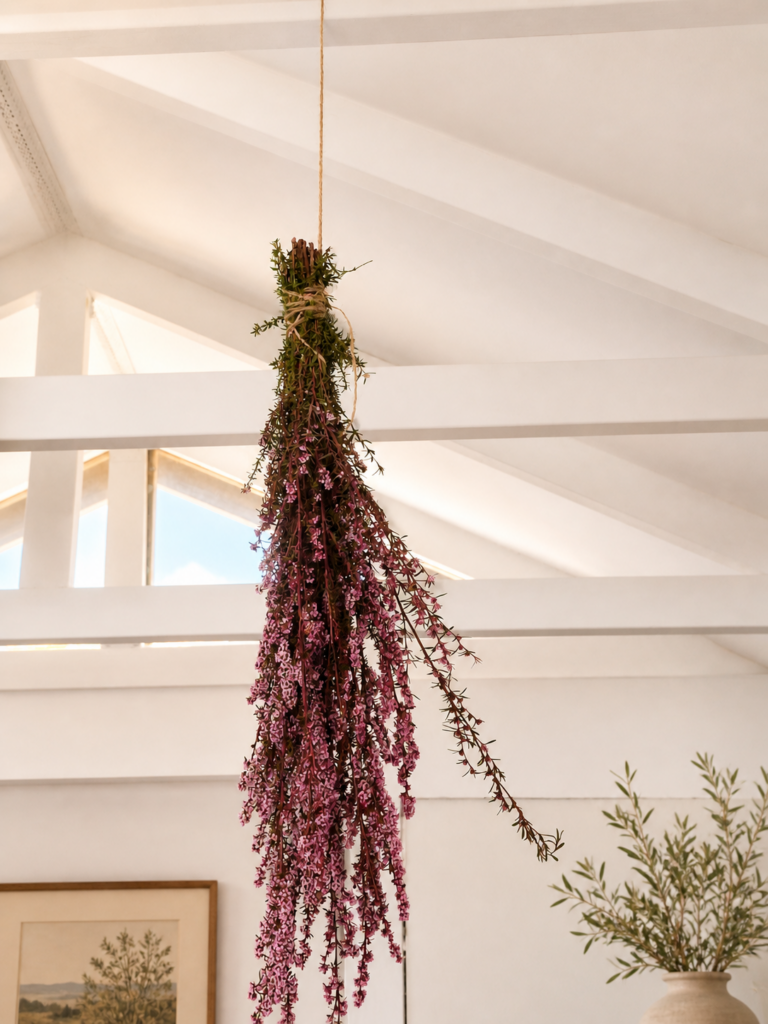
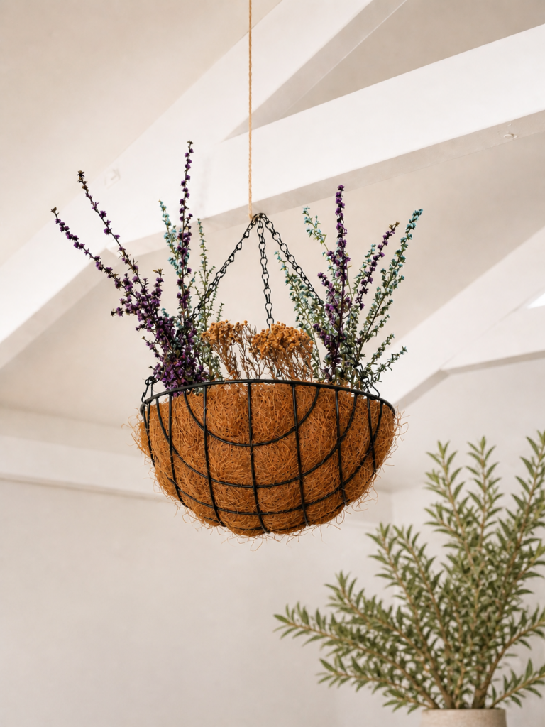
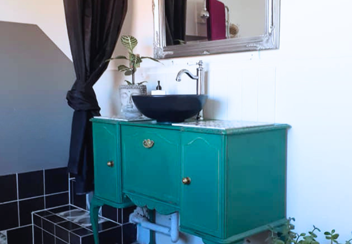
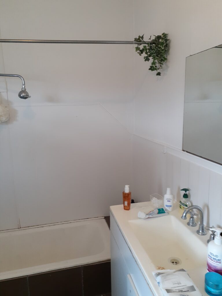
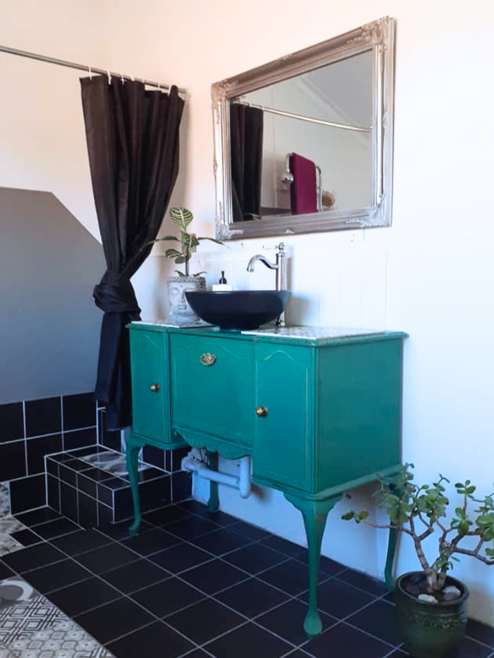
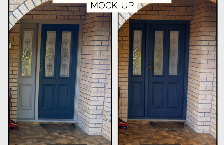
The design direction explored how colour, texture, and entry details could dramatically influence the feeling of each room and the overall experience of the home. Particular attention was given to the emotional impact of tonal palettes – demonstrating how deeper, bolder colours could create warmth, character, and a more grounded atmosphere compared to lighter neutral schemes.

Alongside the visual direction, the project included research and sourcing of suitable products and finishes to help bridge inspiration with practical implementation. Recommendations considered both aesthetic cohesion and the overall mood the clients wanted to create within the space.

Rather than focusing purely on decoration, the project explored how thoughtful material, colour, and sourcing decisions could reshape the emotional experience of the home while still feeling timeless and personally connected to the clients.

Key Elements
– Remote interior direction
– Moodboard and concept development
– Product and finish sourcing
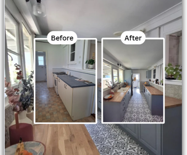
– Colour and material exploration
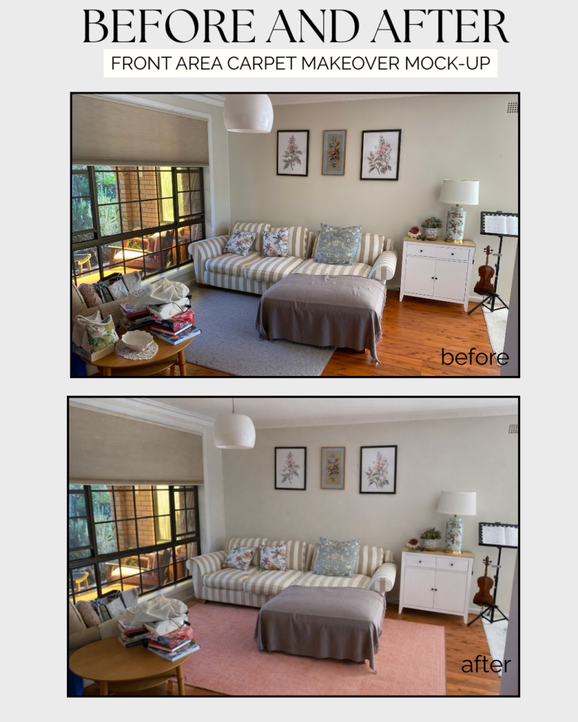
– Carpet and flooring direction
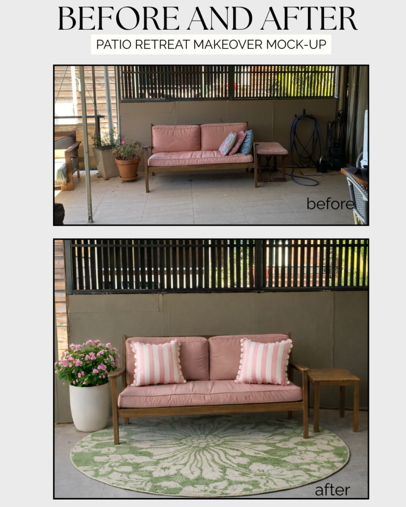
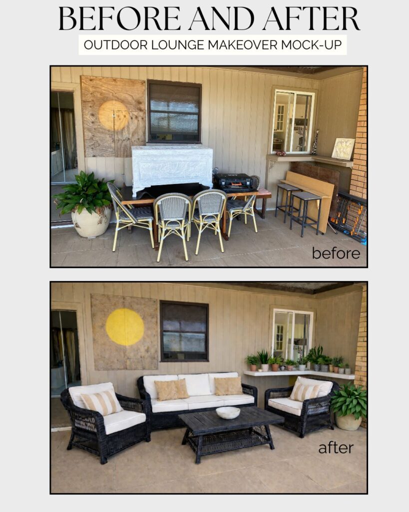
– Entry and exterior colour concepts
– Atmosphere-led visual storytelling

Outcome

A clearer and more confident visual direction for the home – helping the clients move beyond safe, neutral interiors toward a more expressive, layered, and character-rich environment aligned with how they wanted the space to feel.
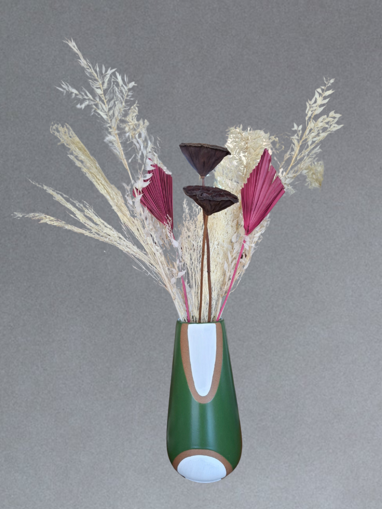
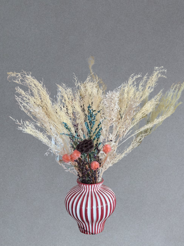
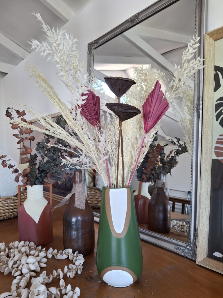
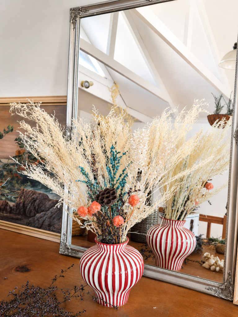
character kitchen tiles

Kitchen Grounded in Pattern

A character-filled workers cottage kitchen reimagined through the transformative use of patterned flooring and tonal contrast – demonstrating how thoughtful surface and flooring choices can completely reshape the atmosphere and identity of a space.

At the centre of the transformation was the introduction of monochrome patterned tiles, designed to ground the narrow galley kitchen with rhythm, movement, and visual depth. Replacing dated laminate flooring that visually flattened the space, the new flooring became the defining feature of the kitchen – introducing a stronger sense of personality while complementing the cottage’s original character.

The flooring was paired with muted green-blue cabinetry and warm timber benchtops to create a layered material palette that feels warm, lived-in, and intentionally balanced. Together, the elements brought greater cohesion, softness, and visual richness to the compact footprint.

Rather than relying on structural renovation, the project focused on how carefully selected surfaces and materiality could elevate both the everyday experience and the perceived value of the home.


Outcome

A warmer and more visually distinctive kitchen where pattern becomes both a functional surface and a defining design feature – creating a space that feels grounded, atmospheric, and deeply connected to the character of the home.

character design verandah

Visual Uplift – Verandah Transformation

A character-filled 1947 cottage verandah reimagined through pattern, contrast, and visual rhythm – transforming a once plain exterior into a more intentional and welcoming arrival space while enhancing the home’s original personality.

Rather than structural renovation, the focus of this project was on atmosphere and perception: using surface, repetition, and tonal contrast to create a stronger sense of identity and cohesion.

The introduction of patterned monochrome tiles immediately changed the visual language of the space, bringing depth, movement, and a more curated architectural feel while complementing the existing federation-inspired detailing of the security doors and exposed timber ceiling.

Scope
Exterior surface refresh
Tile and pattern selection
Visual cohesion and material direction
Character enhancement through contrast and repetition

Design Approach

The project explored how relatively small design interventions can create significant visual impact. The patterned flooring acts almost like a woven surface beneath the architecture – grounding the verandah while elevating the overall perception of the home.

By balancing strong geometric pattern with restrained neutral tones, the result feels both expressive and timeless rather than trend-driven.

Outcome

A warmer, more intentional entry experience with increased visual character, stronger street presence, and a more editorial sense of arrival.

Styling Objects with Story and Impact

A series of styled scenes and imagery created for a purpose-led homewares store, bringing together objects, materials, and story to shape a stronger visual presence both in-store and online.

Working with Oxfam, I supported the development of a more considered and consistent social media presence – focusing on storytelling, community connection, and the real-world impact behind Fair Trade products.

The approach centred on creating on-brand, visually cohesive content that elevated everyday objects through composition, light, and narrative – highlighting not just the products themselves, but the meaning and impact behind each piece.

A key moment was a Christmas campaign designed to position the shop as a destination for thoughtful, ethical gifting. Through a mix of styled imagery, seasonal storytelling, and clear calls to action, the campaign encouraged the local community to engage with Fair Trade and second-hand goods in a more intentional way.

The result was a measurable uplift in foot traffic and sales over the festive period – demonstrating how visual storytelling and values-led content can translate into both social impact and commercial outcomes.

Reimagining a French Cabinet as a Vanity

This project began with a space that was purely functional – a standard bathroom with little identity, minimal warmth, and no real sense of story. While practical, it lacked presence and failed to reflect the personality of the home. Set within a 1947 cottage, this bathroom carried the charm of age, but not its beauty. An old bathtub sat awkwardly lowered into the ground, paired with a dated vanity that felt disconnected from the rest of the home.

The intention was not to fully renovate in a conventional sense, but to reimagine the space through character, materiality, and contrast.

At the heart of the transformation is a repurposed French drinking cabinet, carefully adapted into a vanity. This piece became the anchor – introducing history, depth, and a sense of individuality that immediately shifts the room away from the expected. Its bold green finish adds richness, while the detailing brings a crafted, almost heirloom quality.

Around it, the palette was intentionally restrained yet layered:

Black tiles ground the space and create contrast.
Patterned flooring introduces movement and subtle visual interest.
Warm metals and organic elements soften the composition.
Simple walls and mirror allow the statement piece to breathe.

The result is a bathroom where old and new coexist naturally. It’s no longer just a utility space – it’s an experience, a moment of surprise, and a reflection of a more personal, story-led approach to interiors.

This project captures what Avenell Studio is about:
bringing character into everyday spaces, and transforming the overlooked into something quietly distinctive.